
The psychology of UX on trading and financial platforms
The psychology of financial UX is fascinating because these products aren't just helping people use software. They're shaping how people perceive money, risk, uncertainty, control, trust, and potential loss.
A trading platform can display exactly the same market data as another platform but produce a very different user experience depending on how it presents prices, movement, gains, losses, notifications, and trading actions.
The central question is:
How does an interface influence the way people think, feel, and behave when money is at stake?
1. The psychological foundations
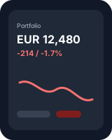
1. Loss aversion
Behavioral economics · Prospect theory
People tend to experience the pain of losing money more intensely than the pleasure of gaining an equivalent amount. A €100 loss may feel more significant than a €100 gain feels rewarding.
UX implication: A red negative balance, a sharply falling chart, or a prominent loss notification can create a disproportionate emotional reaction.
Design opportunity: Show meaningful context, distinguish short-term volatility from long-term performance, and avoid making ordinary fluctuations feel like emergencies.
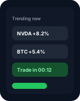
2. Fear of missing out (FOMO)
Social psychology · Attention
Rising prices, trending assets, countdowns, and stories about other people's profits can trigger the fear of missing a profitable opportunity.
UX implication: Users may feel compelled to open the app, check prices repeatedly, or enter a trade before they've evaluated it properly.
Design opportunity: Present the information needed to make a decision without artificial urgency. Explain what a trend means, what remains uncertain, and which costs or risks apply.
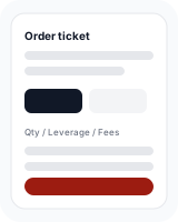
3. Cognitive load
Cognitive psychology · Decision-making
Financial interfaces often contain unfamiliar terminology, percentages, fees, order types, risk metrics, and competing numbers. Every additional decision consumes attention.
UX implication: Users can misunderstand what they own, what they owe, how much they're risking, or what a transaction will cost.
Design opportunity: Use progressive disclosure, plain language, clear defaults, and a hierarchy that puts the most decision-relevant information first.
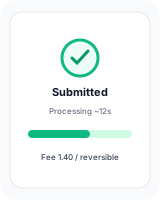
4. Trust and perceived control
Human-computer interaction · Risk perception
People need to understand whether an action has happened, whether their money is safe, and whether they can reverse a mistake.
UX implication: Ambiguous transaction states, unexplained delays, hidden fees, or vague error messages can undermine trust immediately.
Design opportunity: Make transaction status explicit, explain delays, show fees before confirmation, and communicate the difference between submitting, processing, and completing an order.
5. Mental accounting
Behavioral economics · Money perception
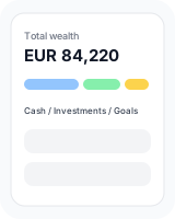
People mentally separate money into categories such as salary, savings, spending money, investment gains, and losses, even though money is economically interchangeable.
UX implication: A user may treat a small trading profit as disposable money while treating an equivalent amount of savings as untouchable.
Design opportunity: Help users understand total wealth, obligations, liquidity, and portfolio-level risk instead of presenting isolated gains as if they existed independently.
These concepts help explain why financial UX requires a different level of care from ordinary consumer UX: interface decisions can affect real financial outcomes.
2. Why trading platforms are psychologically different from banking apps
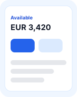
Banking and personal finance
The user wants stability, clarity, security, and control.
- Know how much money is available
- Pay bills without errors
- Understand spending
- Build savings habits
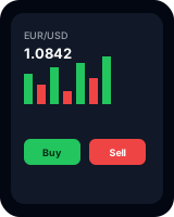
Trading and investing
The user faces uncertainty, fluctuating outcomes, and risk.
- Interpret changing prices
- Decide whether to buy or sell
- Evaluate potential losses
- Manage uncertainty and emotion
The distinction is not absolute: investing platforms can support long-term planning, while banking apps can provoke anxiety about debt or low balances.
In a banking app, a successful experience might mean that the user checks their balance, understands their finances, and leaves in 30 seconds.
In a trading app, the user might spend an hour analyzing markets and still make no transaction. That can be an excellent outcome if they made an informed decision.
Engagement is not the same as user value. This is one of the most important principles in financial product design.
3. The psychological mechanisms behind trading behavior
Variable rewards and intermittent reinforcement
When users check a market, the outcome varies. Sometimes there is an exciting gain, sometimes a loss, and sometimes nothing happens. Unpredictable rewards can reinforce repeated checking.
UX example: Live price updates, red/green animations, and repeated alerts can make checking feel compelling even when there is no useful action to take.
Recency bias and availability
People tend to give disproportionate weight to information that is recent or easy to recall.
UX example: A homepage dominated by today's top-performing assets can make recent winners seem more attractive or representative than they really are.
Better design: Show relevant time horizons, historical context, uncertainty, and risk alongside performance.
Social proof and herd behavior
People use others' actions as a shortcut when they are unsure what to do.
UX example: “Most popular stocks,” trader leaderboards, and displays of other investors' positions can imply that popularity is evidence of a good investment.
Better design: Separate popularity from suitability, disclose the limits of social signals, and avoid presenting other users' activity as a recommendation.
Anchoring and reference points
People evaluate outcomes relative to a reference point, such as their purchase price, a previous high, or a target balance.
UX example: A user who bought a stock at €100 may perceive €95 as a failure and wait for it to return to €100, even when the original investment thesis has changed.
Better design: Provide multiple relevant perspectives, such as total return, portfolio allocation, investment horizon, and risk.
Friction and action bias
When taking action is easy, people may act more often. In uncertain situations, they may also feel that doing something is better than waiting.
UX example: One-tap trading, instant deposits, and highly prominent buy buttons can make a consequential decision feel as routine as liking a social media post.
Better design: Make routine actions convenient while introducing proportionate review steps for high-impact decisions.
Research supports these mechanisms. The UK FCA's research found that features such as flashing prices, push notifications, leaderboards, and prize draws can increase trading frequency and risk-taking. Interface design does not determine behavior alone — knowledge, experience, personality, and market conditions all matter.
4. How individual UI elements change behavior
Explore each element to compare its psychological effect with a more responsible design approach.
Push notifications
Potential psychological risk
A message such as “This stock just jumped 8%” creates urgency and draws attention toward a recent movement.
Responsible design approach
Let users configure alerts around meaningful thresholds and portfolio events. Include context and avoid implying that immediate action is necessary.
What to measure
Useful alert engagement, opt-out rate, and unnecessary trading after alerts.
Good financial UX does not necessarily remove persuasive design. It redirects design effort toward comprehension, appropriate action, and long-term outcomes.
5. The emotional journey of a financial user
Financial UX becomes easier to understand when you examine the user's emotional state throughout a task.
1 Trigger
“The market is moving. I should check my portfolio.”
A notification, a news headline, or a scheduled financial review creates attention.
2 Interpretation
“Am I making money? Is something going wrong?”
The dashboard frames the situation through colors, reference points, headlines, and numbers.
3 Emotional response
“Excitement, anxiety, confidence, regret, or uncertainty.”
The user's existing beliefs and financial circumstances interact with what the interface presents.
4 Decision
“Buy, sell, transfer, investigate, wait, or do nothing.”
Layout, action prominence, information quality, and friction influence the decision process.
5 Feedback
“That was a good decision — or I need to fix this.”
Confirmation messages and subsequent outcomes shape future habits. A profitable outcome does not necessarily mean the decision was sound.
A key concept here is metacognition: the ability to reflect on one's own thinking. A well-designed platform can help users distinguish between:
- What they know and what they are assuming
- What the market is doing and what they feel about it
- What they intended to do and what they actually did
- Whether the outcome was favorable and whether the decision process was reasonable
6. Designing for different financial mindsets
Not all users respond to the same interface in the same way. These are design personas, not fixed psychological types.
The financial beginner
Needs reassurance, plain language, understandable concepts, and guidance about consequences. Design for confidence through comprehension rather than excessive encouragement.
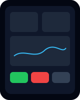
The active trader
Needs speed, precision, reliable data, customization, and visibility into exposure. Reduce unnecessary friction in routine workflows, but retain clear order details and risk controls.
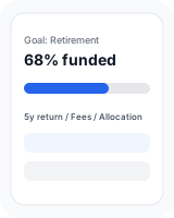
The long-term investor
Needs perspective, consistency, and a clear connection between current decisions and future goals. Emphasize longer-term performance, allocation, contributions, and fees.
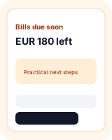
The person managing financial stress
May be dealing with debt, uncertainty about bills, or limited flexibility. Prioritize clarity, nonjudgmental language, transparent options, and practical next steps.
7. Ethical persuasion versus dark patterns
The same technique can be beneficial or harmful depending on its purpose, context, and consequences.
| Design technique | Helpful application | Potentially harmful application |
|---|---|---|
| Defaults | Encourage understandable, user-selected savings plans | Steer users into unsuitable financial products |
| Notifications | Alert users to fraud or important account events | Trigger impulsive trades with sensational headlines |
| Gamification | Reward learning and progress toward goals | Reward frequent trading or risk-taking |
| Simplification | Explain complex fees and risks clearly | Hide important conditions behind simplified screens |
| Friction | Add a review step before a consequential order | Make cancellation or withdrawal unnecessarily difficult |
| Personalization | Adapt education to the user's knowledge | Exploit a user's fears or behavioral vulnerabilities |
8. How to research financial UX scientifically
Illustrative research protocol
Example: Does a portfolio redesign reduce anxiety?
Hypothesis: Showing longer-term context alongside daily performance will improve comprehension and reduce unnecessary reactions to short-term fluctuations.
Experiment: Compare two versions of a portfolio dashboard: one focused on daily performance, and another showing daily and long-term performance with contextual explanations.
Measure
- Accuracy when explaining portfolio performance
- Time needed to identify relevant information
- Self-reported stress and confidence
- Unnecessary checking or trading intentions
Interpretation: The redesign is promising if it improves understanding without hiding material risks or making users overconfident.
A practical financial UX measurement framework
| Dimension | Example metrics |
|---|---|
| Comprehension | Fee comprehension, order-type accuracy, understanding of portfolio exposure |
| Usability | Task success, error rate, completion time |
| Trust | Perceived transparency, confidence in transaction status, complaint rate |
| Emotional experience | Stress, regret, perceived control |
| Behavioral outcomes | Unnecessary transactions, repeated checking, cancellations, savings-plan adherence |
| Financial outcomes | Fees paid, progress toward goals, risk-adjusted performance where appropriate |
Do not assume that an increase in conversion, retention, session duration, or trading frequency represents an improvement. These metrics can rise while user welfare deteriorates.
9. A deeper reading list
Prospect Theory: An Analysis of Decision under Risk
Daniel Kahneman and Amos Tversky · 1979
A foundational paper explaining how people evaluate gains and losses differently from how a purely rational model would predict.
Read the paper ↗
Prospect Theory for Online Financial Trading
Liu and colleagues · 2014
Examines trading behavior at scale, connecting prospect theory to real trading activity.
Read the open-access study ↗
Playing the Market
UK Financial Conduct Authority · 2025
Investigates the relationship between app engagement practices and consumer investment behavior using platform data.
Read the FCA research ↗
Fun and Games: Investment Gamification
CFA Institute · 2022
Discusses gamification, investor trust, behavioral nudges, and ways to encourage reflection rather than unnecessary trading.
Read the report ↗The key takeaway
Financial UX sits at the intersection of cognitive psychology, behavioral economics, emotional design, and human-computer interaction.
The most valuable question isn't simply, “How do we make people use this platform more?”
How do we help people make better-informed financial decisions when their emotions, attention, and judgment are under pressure?
That question leads to more meaningful design choices, better research, and healthier product metrics.